

The Exact Substack Cover Image Size You Need Right Now
You uploaded a cover image, it looked fine in the editor, and then it showed up cropped strangely on your homepage, blurry in a Note, and half-cut in a link preview on Twitter. That's not a bug. Substack uses your cover image in at least five different places, and each one crops it differently.
The Substack cover image size you actually need is at least 600 x 600 px for the cover image itself, and at least 1200 x 630 px (14:10 aspect ratio) for the social/post preview image that shows up when someone shares your post. Those are the two numbers to remember. Everything else on this page is what to do with them.
Table of Contents
- The Exact Substack Cover Image Size You Need Right Now
- Every Other Image Substack Asks For
- Why Substack Crops Your Image Nine Different Ways
- What a Wrong-Size Image Actually Costs You
- How to Design a Cover Image That Survives Every Crop
- The Social Preview Image Is the One That Actually Matters
- Common Cover Image Mistakes That Cost You Clicks
- Fast Ways to Create On-Size Substack Images
- FAQ: Substack Cover Image Size
One number worth having before you start: WriteStack has close to 100 verified reviews from Substack writers across multiple platforms. Most tools in this category have none we could find anywhere.
Every Other Image Substack Asks For
The cover image and the social preview image get most of the attention, but Substack pulls from five separate image slots, and mixing them up is the most common reason a publication looks inconsistent. Substack's own support team publishes exact numbers for each one, and they're worth pinning to a doc instead of guessing every time you upload something new.
| Image type | Recommended size | Notes |
|---|---|---|
| Logo | At least 256 x 256 px | Transparent background |
| Email banner | 1100 x 220 px (can be taller) | Transparent background |
| Cover image | At least 600 x 600 px | Appears on your homepage and welcome page |
| Social / post preview | At least 1200 x 630 px, 14:10 ratio | What shows up when a post gets shared or linked |
| Full-width post images | Max 1:1 height ratio | Taller images get auto-cropped to square |
That table is straight from Substack's own guide to optimal image dimensions, so it's worth bookmarking rather than re-searching every time you're not sure which number applies.
The logo and the email banner get skipped most often, mainly because they're set up once during onboarding and then forgotten. The logo shows up small, in the corner of emails and at the top of the app, which is exactly why undersizing it is so easy to miss: it looks fine at thumbnail scale and only reveals the pixelation when a reader zooms in or views it at full resolution on a larger screen. The email banner has the opposite problem. It's wide and short, and a lot of writers try to reuse their cover image there too, which produces the same stretching issue as reusing it for the social preview.
Practical rule: if you only remember one number, remember 1200 x 630. It's the one that determines what your post looks like everywhere outside Substack itself: Notes, group chats, Twitter, Slack.
Why Substack Crops Your Image Nine Different Ways
A single cover image doesn't render once. It renders in the app, on the web, on your homepage, in your archive, as a small preview, as a banner, and a few more spots beyond that, and each placement grabs a different slice of the source file. Design for the center of the frame and you're usually safe. Design for the edges and something important eventually gets cut off in at least one of those crops.
This is also why a cover image that looks perfect in the upload preview can still come out wrong on mobile. The preview shows you one crop. Readers see whichever crop Substack decided to serve them, based on where they encountered your post.
What a Wrong-Size Image Actually Costs You
It's tempting to treat image sizing as a cosmetic detail, something to fix later if there's time. In practice it shows up in two places that directly affect growth, not just appearance.
The first is the archive page. New visitors who land on your Substack for the first time almost always check the archive before subscribing, scanning a grid of past posts to decide if the publication is worth their inbox. A grid where half the thumbnails are cropped oddly or stretched reads as unfinished, even when the writing underneath is excellent. People judge that grid in under two seconds.
The second is the share. A post that gets restacked, linked in a group chat, or dropped into someone's own Notes carries its preview image along with it. If that image is blank, stretched, or shows the wrong part of the photo, the post loses most of its ability to stop someone mid-scroll. A caption alone rarely does that work. The image is doing more of the job than most writers assume, and a wrong-size image means it's doing that job badly on every single share, not just the first one.
Neither problem shows up as an error message. There's no warning that says "this image is undersized." It just quietly reduces how many people click through, one crop at a time, and the writer usually never finds out why a particular post underperformed.
How to Design a Cover Image That Survives Every Crop
Turn On Smart Cropping If Your Image Has a Face
If your cover image includes a face and that face keeps getting cropped out of the thumbnail, Substack has a fix: go to your Dashboard, open Website Editor, find the Home Page section, and switch Cropping from Center to Smart. Center cropping always grabs the middle of the image. Smart cropping tries to detect and keep the most visually important part instead, which is usually the face. It's a one-click setting, and it's the single most common fix for the "why does my thumbnail cut off my head" complaint.
Keep the Message in the Center Third
If your cover image includes text, a logo, or anything a reader needs to actually read, keep all of it inside the center third of the frame. Treat the outer edges as a margin that might not survive every crop, not as usable space. This one habit prevents most of the "half my headline got cut off" problems people run into after publishing.
Practical rule: design the image as if only the center 60% will always be visible, then treat everything outside that as a bonus that shows up on some crops and not others.
📅 Struggling to stay consistent on Substack?
WriteStack's Smart Scheduling lets you batch and queue Notes in minutes. Grow on Substack without burning out.
Explore Smart SchedulingA quick way to test this before publishing: open the finished image at three different sizes, roughly full-screen, phone-width, and a small thumbnail, and check whether the headline or focal point is still readable at all three. If it disappears at thumbnail size, it needs to move closer to center or get larger relative to the frame. This takes under a minute and catches most sizing problems before a reader ever sees them.
The Social Preview Image Is the One That Actually Matters
Most of Substack's image slots affect how your publication looks to people who are already subscribed. The social preview image is different. It's the one that shows up when your post gets linked in a group chat, restacked as a Note, dropped into Slack, or shared on Twitter, which means it's doing the actual work of getting a stranger to click. At 1200 x 630 px and a 14:10 aspect ratio, it's wider and shorter than the square-ish cover image, and a lot of writers reuse their cover image here without checking whether the crop still works at that ratio. It often doesn't.
The fix is simple: build the social preview as its own asset, sized to 1200 x 630 from the start, rather than hoping the cover image survives the resize. Two images that each fit their slot beat one image stretched across both. This is a five-minute task the first time you set up a template, and closer to thirty seconds every time after that, since you're just dropping a new photo or headline into an existing frame instead of rebuilding the layout.
The part people don't expect: getting the image right is only half of getting the click. WriteStack's Notes dashboard tracks which link inside a Note actually gets clicked, going back to your very first Note, not just the last seven days. So once you fix a preview image, you can see the exact moment click-through on that post started climbing, instead of guessing whether the redesign worked. Most tools in this category only show you this week.
Once your preview image is right, the next lever is getting the post in front of people at all. WriteStack is the only Substack tool that schedules chat posts as well as regular Notes, so the cover image you just fixed doesn't sit unused because you forgot to post about it.
Common Cover Image Mistakes That Cost You Clicks
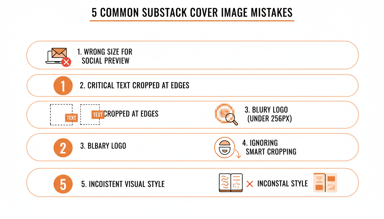
A few patterns show up again and again in publications that struggle with this:
- Reusing the cover image as the social preview without resizing it. The aspect ratios are different (roughly square vs. 14:10), so a straight reuse gets stretched or oddly cropped.
- Putting critical text near the edges. Headlines, logos, and calls to action placed near the border get cut in at least one of the nine crops.
- Uploading a logo under 256 x 256 px. It technically uploads, but it renders soft and pixelated anywhere it gets scaled up.
- Skipping smart cropping on face-forward images. The default center crop frequently slices through a face that smart cropping would have kept in frame.
- Changing visual style post to post. Different colors, different fonts, different layouts every time make a publication's archive look like five different newsletters instead of one.
Practical rule: if you wouldn't recognize your last five posts as coming from the same publication with the titles covered up, the visual style is the problem, not the individual images.
Fast Ways to Create On-Size Substack Images
You don't need design software to hit these dimensions consistently. A few practical options:
- Canva or Figma templates set to the exact pixel dimensions above (1200 x 630 for social preview, 600 x 600 for cover, 256 x 256 for logo) so you're never guessing at resize math.
- A single reusable template with your fonts, colors, and logo placement locked in, so every post starts from a base that already respects the center-third rule.
- Batching image creation with your writing schedule. Most writers design a cover image the same day they publish, under deadline pressure, which is exactly when corners get cut on sizing. Making images a day or two ahead of the post gives room to actually check the crop before it goes live.
That last point connects to a broader problem: image quality tends to slip whenever posting itself feels rushed. WriteStack's Notes scheduler exists for the same reason, queue a week of Notes ahead of time so publishing day isn't the same day you're also improvising a cover image.
A workflow that holds up over months looks something like this: pick one template per image type (cover, social preview, logo) and lock the pixel dimensions into it so resizing stops being a manual step. Build the next post's cover image a day or two before it publishes, not the morning of. Check the archive page itself, not just the single-post preview, since that's where inconsistent sizing actually gets noticed by a new visitor. And keep the source files (the un-cropped originals) organized somewhere searchable, because the same base image usually gets reused for a Note, a social share, and an email banner, and starting from a properly sized original each time is faster than re-deriving the crop from a finished post.
FAQ: Substack Cover Image Size
What is the minimum Substack cover image size? At least 600 x 600 px, per Substack's own guidance. Anything smaller tends to look soft once it's scaled up on the homepage.
What size should my Substack social preview image be? At least 1200 x 630 px, with a 14:10 aspect ratio. This is the image that shows up when a post is shared or linked outside Substack.
Why does my Substack thumbnail cut off part of my photo? Substack defaults to center cropping. If your image has a face or another focal point away from dead center, switch Cropping to Smart in your Website Editor under the Home Page section.
Do I need a different image for Notes than for posts? Notes pull from the same image assets as your post preview, so getting the 1200 x 630 social preview image right covers both. There's no separate "Notes-only" dimension to manage.
What's the maximum size for a full-width image inside a post? Substack caps the height-to-width ratio at 1:1. Anything taller than square gets automatically cropped down to that ratio.
Does Substack compress my images after I upload them? Yes, Substack optimizes uploaded images for web delivery, which is normal and generally not noticeable at the recommended dimensions. Uploading well under the recommended size is what tends to produce visible softness, not Substack's own compression.
Should my email banner match my cover image? It should share the same colors, logo, and general style, but it needs its own file at roughly 1100 x 220 px with a transparent background. Stretching a square cover image into that shape distorts it.
Get the sizing right once, save the templates, and it stops being a decision you make under deadline every week. The harder part is making sure the post carrying that image actually reaches people. WriteStack schedules the Notes that do that, tracks which links inside them get clicked, and benchmarks your numbers against other publications instead of just last week's version of yours. Fix the image, then fix how often people see it.