

I opened my Substack stats page during my second month of writing and had no idea what I was looking at. Forty-two reactions on a post felt like a lot until I saw another writer mention getting four hundred. Three comments felt like nothing until I found out most posts get zero. Every number on that dashboard needed a comparison point I didn't have, so I had no way to tell whether a given post was working, stalling, or just average.
Substack analytics tell you what happened to your publication and never whether it was good. Your dashboard holds your numbers and nobody else's. It can rank your posts against each other, and it cannot rank them against the field, because the data required to do that does not exist inside your account.
One number worth having before you start: WriteStack has close to 100 verified reviews from Substack writers across multiple platforms. The other analytics tools built for Substack have none that we could find anywhere. That is a wide gap in a category where most products launched in the last eighteen months.
Substack isn't hiding anything. It surfaces more raw data than most newsletter platforms. Nobody tells you what a normal number looks like next to those figures, so every stat you check feels like either a private win or a quiet failure. So I pulled reaction counts, comment counts, and word counts from a sample of more than 60,000 real Substack posts, drawn from a corpus of over 3 million posts across thousands of publications, to answer the question directly.
Table of Contents
- Where to Find Your Substack Stats
- The One Question a Per-Account Dashboard Cannot Answer
- The Metrics That Actually Matter
- What Good Engagement Actually Looks Like
- Does Post Length Change Your Numbers?
- Reactions vs. Comments: Which One Predicts Growth
- The Numbers Native Analytics Never Collect
- Retention and Unsubscribe Stats, Read Correctly
- Turning Stats Into an Action Plan
- Five Analytics Mistakes That Waste Your Time
- What Changes Once the Comparison Point Exists
Where to Find Your Substack Stats
Substack spreads your numbers across a few different screens, and most writers only ever look at one of them, usually whichever loads first when they open the app.
The Stats Page's Categories
Your dashboard's Stats tab breaks your account into separate categories: Network, Audience, Retention, Sharing, Notes, Email, Traffic, Unsubscribes, Surveys, and Earnings. Network counts followers across Substack, separate from your email list. Retention shows how long people stay after subscribing, a more honest growth signal than raw subscriber count, since a list that grows fast and churns fast isn't compounding. Traffic tells you where readers found you.
Practical rule: check Retention and Unsubscribes monthly, not daily. Both move slowly, and checking them daily produces noise you'll misread as a trend.
The Post Performance Tabs
Click into an individual post and you land on its performance page, split into five tabs: Overview, Reach, Engagement, Growth, and Discussion. Reach splits views by web, email, and app. Engagement breaks down reactions, comments, and average read time, the closest thing Substack offers to telling you whether people finished the piece.
Growth is the tab most writers skip and the one that matters most for deciding what to write next: it shows how many new subscribers a specific post generated, sorted across your whole archive (Substack's own metrics guide breaks down each field). Sort your Posts page by subscriptions generated instead of views. A post with modest views and a high subscriber-per-view ratio is a better template to repeat than whatever got the most eyeballs.
The One Question a Per-Account Dashboard Cannot Answer
Everything above is a tour of your own history. That is what a per-account dashboard is built to be, and it does the job well. It also has a ceiling no amount of feature development will move, because the ceiling is structural rather than a gap in the product.
Substack's analytics have exactly one publication's data in them: yours. The dashboard can answer "did this post beat my last one" and "is my open rate up since March." Those are questions about your own past. The question you actually sat down with is a different shape: is this good. Not good for me. Good.
That question requires numbers from publications that are not yours. A 6% restack rate on a Note means nothing in isolation. It means something the moment you know that publications your size typically run 3%, or typically run 11%. Substack cannot show you either figure, because it never puts anyone else's data in your dashboard, and it has no reason to. Every writer's stats page is a closed room with one set of numbers in it.
That is why a third-party analytics layer exists for Substack at all, and why WriteStack was built around a comparison set rather than a prettier version of the same account view. WriteStack reads your Notes performance and holds it next to publications in your size band, so your restack rate arrives with a verdict attached instead of a number you have to guess about.
| Analytics question | Substack's native stats | WriteStack |
|---|---|---|
| Which of the two links inside that Note got clicked | No | Yes, per link, back to your first Note |
| Is my restack rate good for a publication my size | No, your account has no one else's data in it | Yes, benchmarked against comparable publications |
| Is engagement climbing or sliding month over month | Snapshots only | Trend analysis over time |
| Notes performance across your full history | Recent window | Your entire Notes archive |
| Replies, mentions, and engagement in one screen | Five tabs | Activity Center |
| Which paragraphs readers actually spend time on | No | Yes, section-level heatmap |
| Which individual subscribers engage most | Partial | Yes, surfaced by name |
| Reactions, comments, opens, delivery rate | Yes | Yes |
| Verified reviews from Substack writers | Not applicable | ~100 across multiple platforms |
Start a free 7-day trial and put a comparison point next to every number on your dashboard.
The Metrics That Actually Matter
Substack surfaces a lot of numbers, and most are only meaningful in relation to each other. A view count of 2,000 means something different for a list of 500 than for a list of 50,000, and the dashboard doesn't normalize that for you.
Views, Recipients, and Delivery Rate
Views count every time your post loads, so one reader who opens it five times counts five times. Recipients is cleaner: how many subscribers actually got the post, counted once each. Delivery rate is the percentage who received it, and it's worth checking on a schedule rather than per post. Under 90% usually means a chunk of your list has gone stale, whether that's abandoned addresses, domains flagging you as spam, or subscribers who stopped opening anything long ago. A look at your Email stats tab once a quarter catches this before it drags down your sender reputation.
Open Rate, Reactions, and Clicks
Open rate is the percentage of recipients who opened the email version of your post. Writers obsess over it, and it's also the number most distorted by privacy tools like Apple Mail Privacy Protection, which inflates opens when an email client pre-loads images regardless of whether a person looked at the message. A newsletter can show a 55% open rate where the real count of humans who read past the subject line is much lower.
Reactions and comments require an actual decision to click something, which makes them a more honest read on whether a post landed. Link clicks sit above both, and they are where Substack's native reporting gets thin. A click is a reader leaving the page to go where you sent them, the strongest signal short of a subscription. Substack will not tell you which of two links inside a single Note earned that click, and it will not hold that history open across your archive. WriteStack does both.
Practical rule: treat open rate as a rough directional signal, reactions plus comments as your real engagement metric, and link clicks as the closest thing to intent you can measure.
What Good Engagement Actually Looks Like
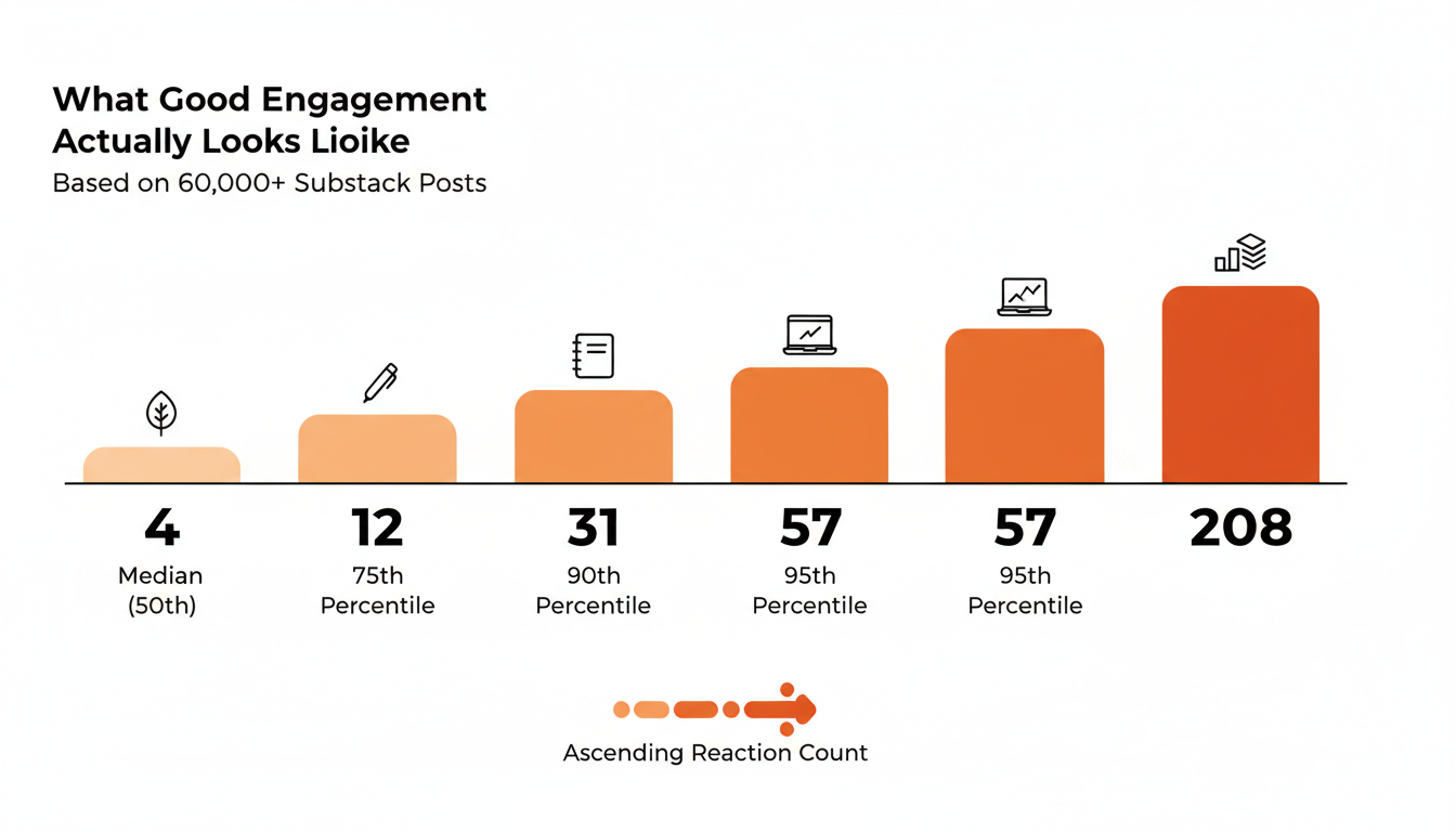
This is the part most guides skip, because it requires data from other people's publications instead of general advice. I sampled reaction counts across more than 60,000 posts to find where a normal post actually lands.
| Percentile | Reactions per post |
|---|---|
| Median (50th) | 4 |
| 75th | 12 |
| 90th | 31 |
| 95th | 57 |
| 99th | 208 |
The median post gets four reactions. Half of all posts on Substack get four or fewer, including posts from publications with thousands of subscribers. The average was closer to 20, pulled upward by a small number of posts with outsized reach, so the median is the more honest baseline. About 14% of posts got zero reactions at all, which makes a zero the outcome for roughly one in seven posts across the platform rather than a sign something went wrong.
The gap between the median and the higher percentiles is steep. Getting from 4 reactions to 12 roughly triples your result and puts you in the top quarter. Getting to 31 puts you ahead of nine out of ten posts on Substack. The 208 at the 99th percentile reflects posts that went genuinely wide, usually through a Notes cycle or a large recommendation network.
Notice what those five rows just did. They performed the one operation your Substack dashboard structurally cannot, and they did it with a static table from a fixed sample. A live version of that comparison, updating against your own account every time you publish, is what turns a percentile table into a working instrument, and that is what WriteStack keeps running in the background.
Practical rule: if your post gets 10+ reactions, you're already outperforming most of Substack. Don't calibrate your sense of good against a handful of viral posts from writers with ten times your list size.
Does Post Length Change Your Numbers?
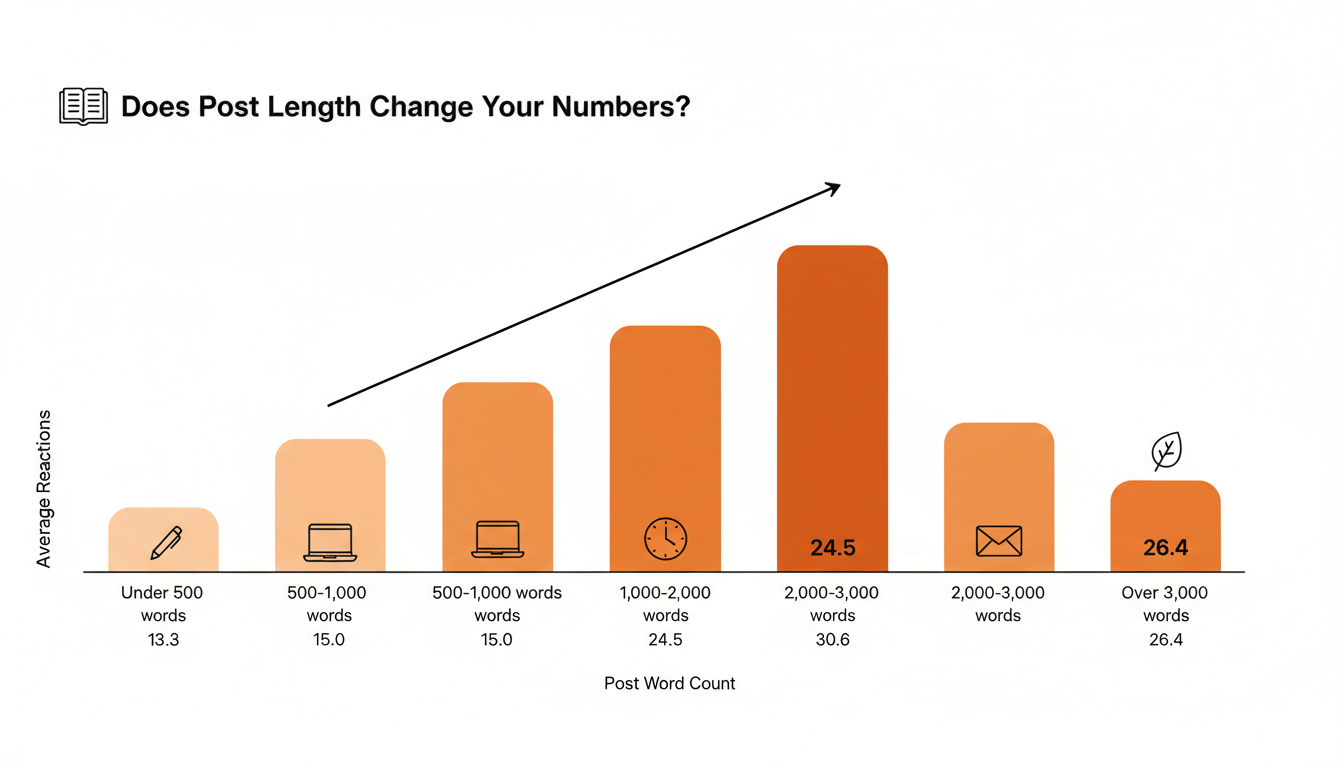
I broke the same sample down by word count to test whether length predicts engagement.
📅 Struggling to stay consistent on Substack?
WriteStack's Smart Scheduling lets you batch and queue Notes in minutes. Grow on Substack without burning out.
Explore Smart Scheduling| Word count | Median reactions | Avg reactions | Avg comments |
|---|---|---|---|
| Under 500 | 3 | 13.3 | 2.6 |
| 500–1,000 | 5 | 15.0 | 3.5 |
| 1,000–2,000 | 6 | 24.5 | 4.9 |
| 2,000–3,000 | 6 | 30.6 | 6.0 |
| Over 3,000 | 7 | 26.4 | 6.5 |
Engagement climbs steadily as posts get longer, up through the 2,000 to 3,000 word range, then drops past 3,000. There's a real ceiling where added length stops paying off and starts costing you finishers. Short posts can still perform well, but the data doesn't support "keep it short for engagement" as a general rule.
Two things are probably happening at once. Longer posts cover more ground and give readers more surface area to react to. A post past 3,000 words also asks for a real time commitment, and some readers react to the idea of it without finishing, which caps what extra length can buy.
Reactions vs. Comments: Which One Predicts Growth
A reaction costs a reader one tap. A comment costs them an actual thought, typed out in public, attached to their name. In the sample, median comments per post sat at zero, while average comments were closer to 4, skewed by a smaller set of posts that generated real discussion.
That gap matters because comments correlate more tightly with new subscriptions than reactions do. A post that gets people replying made someone feel like they had something to add, and readers who feel like part of a conversation convert at a higher rate than readers who liked something in passing. The word count data agrees: the same 2,000 to 3,000 word range that produced the highest average reactions also produced the highest average comments, roughly 6 per post versus 2.6 under 500 words.
Reactions aren't worthless. A post with plenty of reactions and no comments is a different situation from a post with nothing at all. It does mean that if your stats page forces you to pick one number to chase, comments are the one.
Chasing comments is where the workflow gets expensive. Replying quickly is the highest-return thing you can do to keep a thread alive, and doing it natively means bouncing between your inbox, the Notes feed, your post's Discussion tab, and the app. WriteStack's Activity Center collects replies, mentions, and new engagement into one screen, so answering the first five comments on a post takes one pass instead of five open tabs and a decision about which to check first.
Start your free trial and answer every reply from one screen.
The Numbers Native Analytics Never Collect
Two categories of data never show up in a Substack dashboard, and both change how you write once you have them.
The first is link-level click data on Notes. Substack tells you a Note got engagement. It does not tell you that the Note contained two links, that 40 people clicked the one pointing at your archive and 3 clicked the one pointing at the source article, and that the ratio has held across every Note you've written in that format. That is the difference between "this Note performed well" and "this Note sent 40 people into my back catalogue, and the second link is dead weight I should stop including."
The second is direction. Your stats page is a series of snapshots, and a snapshot cannot tell you whether a 5% restack rate is a recovery or a slide. A 5% rate that was 3% in April is a publication finding its footing. The same 5% that was 9% in April is a publication with a problem, and the two look identical on a dashboard that only shows you today.
The part people don't expect
WriteStack tracks which of the two links inside a Note got clicked, going back to your very first one, so a Note's performance stops being a like count and becomes a destination report. It benchmarks your restack rate against other publications your size, which is the one question your own dashboard structurally cannot answer. And it shows the direction that rate is moving month over month rather than where it sits today. Open the dashboard on a Tuesday and see that the Note you almost didn't post drove 40 link clicks, and that your restack rate is running well above typical for a publication your size. Not better than last week. Better than the field.
The analytics also feed back into the writing, which surprises people more than it should. WriteStack's Notes generator drafts from Notes and posts you've already published, so the formats your click data says are working become the starting point for the next batch instead of something you have to remember and manually imitate. If a draft misses, you switch models rather than living with one fixed voice. Most tools generate from a prompt and hand you something to rewrite three times.
Retention and Unsubscribe Stats, Read Correctly
Every publication loses subscribers. The Unsubscribes section will show a small trickle after nearly every send, which is normal rather than a sign your last post failed. What matters is the rate relative to your list size and whether it spikes after specific posts.
A spike usually means that post reached a broader audience, through a Note going wide or a recommendation swap, and pulled in people who weren't a fit and opted back out once they saw regular content. That churn is a normal side effect of successful reach. A spike not tied to any reach event is the one worth investigating: check whether your frequency, tone, or the value each post delivers has shifted.
The Retention tab shows a cohort view over longer timeframes, tracking what percentage of subscribers from a given month are still subscribed several months later. A publication holding 80% six months in is in a different position than one holding 50%, even with similar reaction counts. The same limitation bites hardest here: Substack shows you your curve and no one else's, so an 80% figure sits on the screen without a verdict. Trend analysis inside WriteStack answers the version you can act on, which is whether the curve is steepening or flattening across your last several cohorts.
Turning Stats Into an Action Plan
Numbers on a dashboard don't do anything until you act on them. Four things worth doing with the benchmarks above:
Sort your last ten posts by comment count instead of views and reread the two that outperformed. Look at how they open and what claim they make that a safer post wouldn't. WriteStack's heatmap shows which sections of a post people actually spend time on, which turns "this post did well" into "this specific paragraph is why."
Identify your most engaged readers instead of guessing from aggregate stats. WriteStack's fans feature surfaces the subscribers who consistently react, comment, and share, so you see who your writing is landing with instead of treating your list as one undifferentiated number.
Read your Notes by link clicks, not reactions. Pull the last twenty, sort by clicks per view, and look at what the top five share structurally. Reactions tell you a Note was pleasant. Clicks tell you it moved someone.
Stop comparing your averages to outliers. Use the percentile table above as a starting baseline, then run your account against a live comparison set so the baseline updates as the platform does.
Five Analytics Mistakes That Waste Your Time
Checking stats within an hour of publishing. Early numbers are dominated by your most engaged subscribers, the ones who open every email right away. A post that looks quiet at hour one can end up in your top five once search traffic catches up.
Judging a post by open rate alone. Privacy tools distort this number in ways you can't detect post by post. Two posts with identical open rates can have completely different real readership depending on which email clients your subscribers use.
Comparing your account to a much larger one. A newsletter with 50,000 subscribers and one with 500 aren't playing the same game. Benchmarks from publications in your own size band are the comparison that means something, which is the job WriteStack's benchmarking does and the job your Substack dashboard has no data to attempt.
Ignoring the Growth tab on individual posts. Views tell you reach. The Growth tab tells you which posts convert readers into subscribers, and that's the number that compounds.
Treating a slow week as a trend. Reaction and comment counts are noisy week to week even for established writers. Look at rolling four-week averages before deciding something is declining. Month-over-month trend analysis does that reading for you and removes the temptation to draw a line through two data points.
What Changes Once the Comparison Point Exists
Track one month before you change anything. Write down what you published, what each post got, and what you concluded from the number. Almost every writer who does this finds the same shape: conclusions drawn from figures with nothing to compare against, and a mood that tracked whichever post happened to land last.
A month into running your account against real comparison data, the change isn't that your numbers jump. It's that you stop guessing. A quiet week reads as a quiet week rather than a verdict on your writing. A Note with 40 link clicks gets repeated because you can see it earned them, not because it felt good. The restack rate climbing month over month carries you through the week where nothing lands, because you can see the direction underneath the noise.
Substack's own analytics do the first half of this well, and they will always stop at the edge of your account, because that is the only data in the room. Link-click history across your full Notes archive, benchmarks against publications your size, trend analysis showing direction instead of snapshots, and an Activity Center that collects engagement into one screen are the layer that finishes the job, and WriteStack is the tool that ships all of them together. Close to 100 verified reviews from Substack writers back that up, and no other tool built for Substack has any we could find.
Start a free 7-day trial. Open your dashboard on a Tuesday and find out, for the first time, whether the number in front of you is any good.