
You open your Substack homepage on a Thursday morning and notice a small black button in the bottom-right corner that says Customize website, with an orange "New" tag. Click it and a little card slides up over your site with a layout menu, a color picker and a font list. Five minutes later your newsletter looks like a different publication, and nothing has gone live yet.
That card is the front door to the Substack website editor, the design tools Substack launched on 12 Nov 2026. This guide walks through every control with our own screenshots from The Substack Data Analysis, then covers the choices that make a site easier to read and easier to subscribe to.
TL;DR, checked 13 Nov 2026: Substack's website editor lets you change your site's theme, colors, fonts, header and wordmark. While signed in on a desktop browser, click Customize website on your homepage to open the Mini-Editor, then Continue in full editor for every setting. Preview Desktop, Tablet and Mobile web, then click Save and Publish. Changes don't appear in the Substack app. Source: Substack Help.
Contents
- What is the Substack website editor?
- Mini-Editor vs Full Editor
- How to open the editor and change your design
- Quick changes in the Mini-Editor
- Layout: the 7 Substack themes
- Colors and palettes
- Fonts, the dice icon and Shuffle all
- The Full Editor, tab by tab
- Change your Substack fonts
- Header, wordmark and title size
- Assets: logo, wordmark, images and buttons
- Customize the Welcome, Post and other pages
- Preview on Mobile web, then Save and Publish
- Best practices for a Substack design that works
- Match the theme to your content
- Check contrast before you commit
- Keep fonts to one pair
- Size the wordmark for phones
- Change one thing at a time on an established site
- Remember the app and the inbox
- After you publish: tell your readers
- Substack website editor FAQ
- Where is the Substack website editor?
- Can I change my Substack design in the app?
- Will readers see my changes before I publish?
- How many themes does Substack have?
- Can I upload my own font to Substack?
- What size should my Substack wordmark be?
- How do I switch my homepage back to my profile?
What is the Substack website editor?
The website editor is where you control how your publication's website looks to visitors: theme, header, homepage blocks, footer, colors, fonts and branding. Substack rebuilt it on 12 Nov 2026 and announced it in Your Substack, now with more ways to customize. The announcement says it ships with seven themes "to use as a jumping-off point."
It only affects your website. Substack is direct about this: "The Substack app has its own layout, so your changes will not appear there." Readers who open your posts in the app keep seeing the app's design.
Mini-Editor vs Full Editor
There are two ways into the same design system. The Mini-Editor is a small card over your live homepage for fast experiments. The Full Editor is a sidebar with every setting, across your Home, Welcome and Post pages (plus Podcast and Section pages if you have them).
| Mini-Editor | Full Editor | |
|---|---|---|
| Where it opens | Bottom-right of your homepage | Full page, with a settings sidebar |
| Controls | Layout, Colors, Fonts, Shuffle all | Overview, Theme, Colors, Fonts, Assets |
| Pages you can edit | Home | Home, Welcome, Post, Podcast, Section |
| Header and wordmark | No | Yes |
| Homepage blocks and footer | No | Yes |
| Device preview | Desktop, Tablet, Mobile web | Desktop, Tablet, Mobile web |
| Best for | Trying looks in a few minutes | Finishing and publishing a design |
Practical rule: Use the Mini-Editor to find a direction, then move to the Full Editor before you publish. The Full Editor is where the header, the Welcome page and Mobile web details get checked.
How to open the editor and change your design
Substack's help center lists three ways in. Here is the full path from start to a published design.
- Sign in on a desktop browser and open your publication's homepage.
- Click Customize website in the bottom-right corner. If your homepage is still your Substack profile, the button says Create your website instead. You can also open the editor from Dashboard > Website editor or Settings > Website > Edit theme.
- Try a Layout, Colors and Fonts in the Mini-Editor card.
- Click Continue in full editor to see every setting.
- Pick the page to edit next to Now editing: (Home, Welcome, Post, and Podcast or Section if you have them).
- Adjust the header, blocks, colors, fonts and assets in the sidebar tabs.
- Preview Desktop, Tablet and Mobile web using the buttons at the bottom of the preview.
- Click Save, then Publish. Your design stays in the editor until you do.
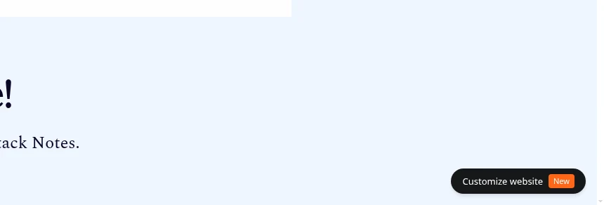
Our screenshot shows the button on The Substack Data Analysis homepage while signed in. Visitors don't see it.
Quick changes in the Mini-Editor
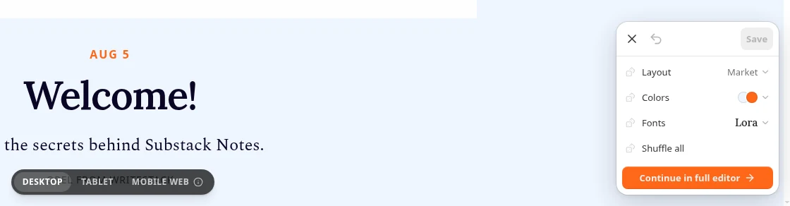
The Mini-Editor card has a close button, an undo arrow and a Save button along the top. Below that are four rows: Layout, Colors, Fonts and Shuffle all, then an orange Continue in full editor button. A pill at the bottom of the page switches the preview between Desktop, Tablet and Mobile web.
Layout: the 7 Substack themes
The Mini-Editor calls it Layout. The Full Editor and the announcement call the same list themes. Open the menu and you get seven options: Classic, Studio, Letter, Cinema, Blog, Market and Gallery. Studio carries the hint "Works best with a podcast."
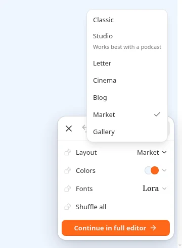
Substack's help article describes what each theme is for:
| Theme | What it looks like | Best for |
|---|---|---|
| Classic | The standard Substack homepage, with the most layout options | Any newsletter |
| Studio | A big photo of your show, your latest episode and where to listen | Podcasts and video |
| Letter | Simple headlines with plenty of space | Essays and long reads |
| Cinema | Bold, image-led layout with dramatic headlines | Photo and visual stories |
| Blog | Posts in a single column with links on the side | Writers who post often |
| Market | Large headlines in rows and columns | Lots of short posts |
| Gallery | Images arranged in columns | Art and photography |
If you used the older Magazine or Newspaper hero layouts, they now live inside the Classic theme. The announcement refers to Cinema as "Cinematic"; the menu label is Cinema.
Practical rule: Choose the theme that matches what you publish most. A photography newsletter wants Gallery or Cinema. A weekly essay wants Letter. If you're unsure, Classic has the most options to adjust later.
Colors and palettes
The Colors row opens a grid of 28 two-tone presets with names like Press, Oxblood, Terracotta, Klein, Sea glass, Sage, Noir and Midnight. Each preset is a two-tone swatch; click one to apply it.
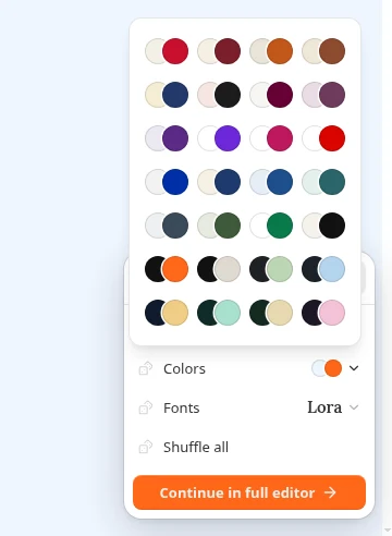
In the Full Editor, the Colors tab goes further. You can set each color yourself under Your colors with the new color picker, or choose from Quick palettes, grouped by mood such as Moody, Bold, Earthy, Coastal and Modern. On the Classic theme, Your colors covers Background, Accent, Welcome, Header, Footer, Secondary footer and Subscribe. Other themes show their own list.
Fonts, the dice icon and Shuffle all
The Fonts row sets your headline font from a list that includes Lora, Scope One, Instrument Serif, DM Serif Display, Gloock, Playfair Display, Anton, BBH Hegarty, Caprasimo, Courier Prime, SF Pro and Roboto Mono.
Each row has a small dice icon. Click it to try a random option for that row only. Shuffle all randomizes layout, colors and fonts together. Substack's help center says shuffling never publishes anything, and the undo arrow takes you back if you shuffle past a look you liked.
Practical rule: Shuffle to explore, then undo. Shuffling is fast at showing you what your publication shouldn't look like, which narrows the choice quickly.
That last point comes from a writer with early access. Kyle Raymond Fitzpatrick of The Trend Report told Substack that Shuffle all "definitely taught me what the publication maybe shouldn't look like, which is its own kind of useful."
The Full Editor, tab by tab
Click Continue in full editor and your site moves to the right while a sidebar opens on the left. At the top is Now editing: with buttons for each page. For the Home page, the sidebar has five tabs:
| Tab | What you do there |
|---|---|
| Overview | Theme, Colors and Fonts in one place, plus Shuffle all |
| Theme | Choose a theme and arrange the header, hero, blocks and footer |
| Colors | Set each color or pick a palette |
| Fonts | Set each font or pick a pairing |
| Assets | Upload your logo or wordmark and style post images and buttons |
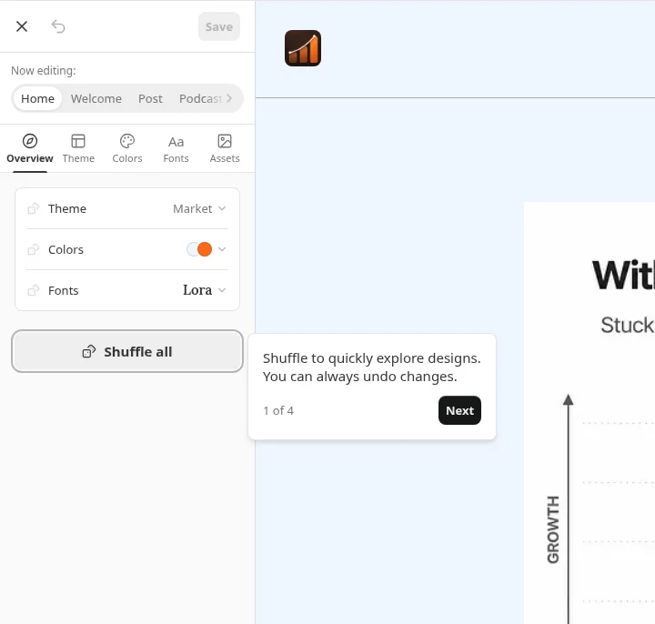
The Theme tab is where the homepage structure lives. Below the header and hero you can add up to 10 blocks (List, Grid and Feature for posts, or Subscribe and Promo card) and drag them into order. Each post block can pull from recent posts, a tag or a section. Depending on the theme you can also add sidebar modules such as Subscribe, Recommendations, Top posts or Links. If your Substack recommendations are a growth channel, the Recommendations module puts them on your homepage.
Change your Substack fonts
The Fonts tab has two parts. Your fonts lets you pick each font separately. On our Market theme that's Headings (Lora) and Body (Spectral). On the Classic theme you get Wordmark, Post titles, Body and Section titles. Quick pairings gives you ready-made sets, filtered by Suggested, Bold, Chic, Retro and Masthead. Examples on our screen included Lora with Spectral, Special Gothic with Inter, and BBH Hegarty with Inter.
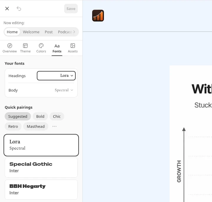
Font size is set automatically by the font you pick. Substack's custom fonts help article describes choosing from the editor's list and Quick pairings; it doesn't describe uploading your own font file.
Practical rule: Start from a Quick pairing, then change one side only if you need to. Pairings were chosen to work together, and a body font built for long reading matters more than a flashy headline.
Header, wordmark and title size
Open the Header card under Blocks in the Theme tab (on our screen, selecting the publication name in the preview opened the same panel). It has Title and images with Upload a wordmark image and a Title size slider, and a Display section with Layout (Standard on our site). Arrows on the Header card step through the header layouts your theme offers.
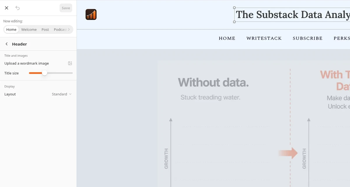
If you upload a wordmark, the slider becomes Wordmark size. Substack's guidance for the wordmark is 1344 x 256 pixels or larger. Our Substack image sizes guide covers the wordmark's 21:4 maximum ratio and every other image Substack asks for.
Assets: logo, wordmark, images and buttons
The Assets tab holds your brand files and a few style settings:
- Logo: a square image, 256 x 256 pixels or larger, ideally with a transparent background.
- Wordmark: a wide image of your publication name, 1344 x 256 pixels or larger. It replaces the text name in your header.
- Corners and Cropping (Classic): how rounded post images are, from None to Absurd, and whether images crop to the center or to the most interesting part (Smart).
- Buttons and Likes & comments (other themes): button styles such as Solid, Pill or Outline, and whether likes and comments show on post previews.
Struggling to stay consistent on Substack?
Batch and queue your Substack Notes in minutes, track which Notes convert subscribers, and grow without burning out.
Customize the Welcome, Post and other pages
Switch pages next to Now editing:. The Welcome page is what first-time visitors see before they subscribe, and it's worth more attention than most writers give it.
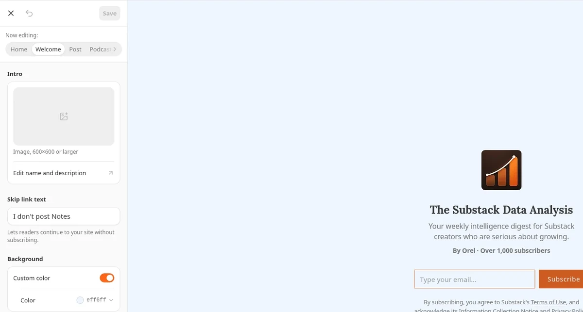
On the Welcome page you can:
- Add an image of 600 x 600 pixels or larger. After you add one, you can show or hide your publication name and description.
- Click Edit name and description to change that text in your settings.
- Change the Skip link text, the link readers click to continue without subscribing. The default is "No thanks," and Substack's Welcome page help article allows up to 25 characters. On our site it reads "I don't post Notes."
- Turn on Custom color for the page background.
The Post page settings apply to every post once you publish: links shown underlined or in your accent color, drop caps, author names and photos, and previous and next links at the end. Podcast and Section pages appear in the switcher only if your publication has a podcast or sections.
Practical rule: Treat the Welcome page like a landing page. The description should say who it's for and how often you send, the same job your About page does.
Preview on Mobile web, then Save and Publish
The buttons at the bottom of the preview switch between Desktop, Tablet and Mobile web. Mobile web shows your site in a phone's browser, which is where many people land when they tap a link to your site in an email, a text message or a social app.
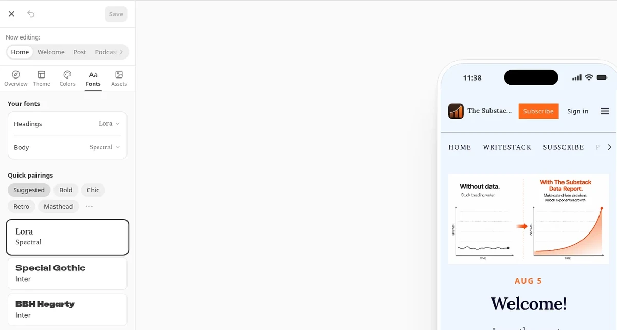
Our own preview shows why this step matters. On Mobile web, the publication name shortens to "The Substac..." and the navigation row cuts off after Subscribe, with a scroll arrow at the edge. Neither shows up on Desktop.
If you have only a few posts, the editor can fill the preview with Sample posts (toggle at the bottom-left). They appear only in the editor and are never published or emailed.
When it looks right, click Save, then Publish. The announcement puts it plainly: "Your new design won't go live until you hit save, so feel free to explore at your own pace."
Best practices for a Substack design that works
A redesign is fun. These choices decide whether it also helps readers read and subscribe.
Match the theme to your content
Pick the theme from what you publish, using the table above. Long essays read best with space (Letter). Frequent short posts suit Market or Blog. Visual work belongs in Gallery or Cinema. Podcasts and video get a dedicated layout in Studio. If you just switched your category to photography, see our Substack categories guide, and pair that change with Gallery or Cinema.
Check contrast before you commit
The early-access writers' first tip in Substack's announcement is "Check legibility when you choose colors, because it's all about the writing." Substack's help article adds a specific one: choose an accent color that stands out against your background so your Subscribe button is easy to spot. For body text, the WCAG contrast guideline asks for at least 4.5:1 between text and background. Dark text on a light background is the safe default; if you go dark, test a full post on Mobile web.
Practical rule: Your Subscribe button should be the most visible colored element on the page. If the accent blends into the background, change the accent first.
Keep fonts to one pair
One heading font and one body font is enough. A display face like Anton, Caprasimo or Gloock can carry a headline, and it gets tiring over 1,500 words of body text. Start from a Quick pairing and keep the body font plain, so the headline carries the personality.
Size the wordmark for phones
Upload a wordmark at 1344 x 256 pixels or larger, then check it on Mobile web with the size slider. A long publication name or a wide wordmark that looks great on desktop can shrink or get cut off on a phone, as ours did. If it does, lower the size or use a shorter wordmark.
Change one thing at a time on an established site
If readers know your site, a total redesign can feel like a new publication. FOUND, a city guide featured in the announcement, kept the Classic theme and used the new header image to put its brand front and center. Starting with fonts, colors or the header keeps what readers recognize while still freshening the look.
Remember the app and the inbox
Your website design doesn't appear in the Substack app, and the announcement suggests thinking about "how your images, flourishes, and tone can carry from your site into people's inboxes." Keep your email header and post images consistent with the new colors so a reader who meets you in the inbox and then on the web sees the same publication. The Substack image sizes guide has the email banner dimensions.
After you publish: tell your readers
Substack's own announcement ends by inviting writers to "share your new look in Notes." A short Note with a before and after screenshot gives readers a reason to visit your site and see the new look.
One Note on launch day is easy to forget, though. If you want the reveal followed by a few Notes that point readers to your best posts on the new site, WriteStack lets you write those Substack Notes ahead and schedule them for the week. Sync runs automatically through the WriteStack Chrome extension. Our guide on how to schedule Substack Notes covers both Substack's native scheduler and a queue.
Substack website editor FAQ
Where is the Substack website editor?
Click Website editor in your dashboard's left sidebar, go to Settings > Website > Edit theme, or click Customize website on your homepage while signed in on a desktop browser.
Can I change my Substack design in the app?
The help center describes opening the Mini-Editor from a desktop browser, and design changes only affect your website. Substack says the app "has its own layout, so your changes will not appear there."
Will readers see my changes before I publish?
No. Changes stay in the editor until you click Save and then Publish. Shuffling never publishes anything, and sample posts appear only in the editor.
How many themes does Substack have?
Seven: Classic, Studio, Letter, Cinema, Blog, Market and Gallery. The Mini-Editor labels them as Layout. The older Magazine and Newspaper hero layouts are inside the Classic theme.
Can I upload my own font to Substack?
Substack's help center describes picking fonts from the editor's list or from Quick pairings. It doesn't describe uploading a font file. You can set headings and body separately, and on Classic also the wordmark and section titles.
What size should my Substack wordmark be?
Substack recommends 1344 x 256 pixels or larger for the wordmark and 256 x 256 or larger for the square logo. Check the result on Mobile web and adjust Wordmark size if it gets cut off.
How do I switch my homepage back to my profile?
Click Switch to profile in your publication's Settings. To go the other way, go to Settings > Website and click Create your website.
A new design gets people to look. Notes get them to visit, and a steady run of Notes keeps them coming back. WriteStack helps you plan and schedule those Substack Notes, so the Notes pointing to your new site go out on the days you planned.